🔗 https://techtown.in/power-bi/data-visualization/
(Topic: Power BI Data Visualization – Best Charts, Tips & Practices)
🎨 Power BI Data Visualization – Bringing Your Data to Life
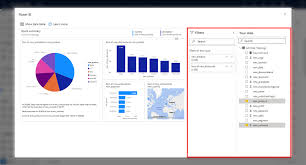
Data is powerful — but only if it’s understood. Visualization bridges the gap between raw numbers and actionable insights.
Power BI gives you a rich set of visualization tools to convert data into beautiful, interactive, and insightful reports.
📊 Why Data Visualization Matters
Without visualization:
- Data is overwhelming
- Patterns stay hidden
- Insights are missed
With effective visuals:
- Trends become obvious
- Stories become clear
- Stakeholders make better decisions
Power BI lets you build dashboards that are not just informative — they’re decision-ready.
🧱 Basic Visualization Types in Power BI
| Chart Type | When to Use |
|---|---|
| Bar/Column Chart | Compare categories or values |
| Line Chart | Show trends over time |
| Pie/Donut Chart | Show parts of a whole (max 3-4 categories) |
| Cards/KPIs | Show single metric like Total Sales |
| Matrix/Table | Detailed, grid-based data display |
| Area Chart | Show cumulative or stacked values |
| Gauge | Compare against a target |
| Scatter Chart | Analyze correlations or distribution |
🎯 Tip: Use Tooltips, Drill-through, and Bookmarks for added interactivity.
📈 Visual Best Practices
✅ Use the right chart for the right story
- Don’t use pie charts for too many values
- Use bar charts for category comparison
✅ Keep visuals clean
- Avoid clutter
- Use neutral colors with 1–2 highlight shades
✅ Label clearly
- Use data labels, titles, and tooltips
- Avoid ambiguous abbreviations
✅ Use slicers and filters
- Let users explore data on their own
- Add date, category, and region slicers
✅ Prioritize KPIs
- Use cards, KPIs, or gauge visuals to surface key metrics like Revenue, Profit %, or Customer Count
🖥️ Interactive Visual Elements
| Feature | Benefit |
|---|---|
| Slicers | Filter visuals by region, date, product etc. |
| Drill Down/Up | Explore data hierarchically (e.g., Year > Month > Day) |
| Bookmarks | Create clickable storytelling experiences |
| Tooltips | Hover to reveal detailed insights |
| Buttons & Navigation | Build interactive reports and tabs |
🔄 Cross-Filtering & Highlighting
In Power BI, selecting a bar, point, or card can highlight related values across other visuals — this makes reports dynamic and intuitive.
You don’t just look at data — you interact with it.
📋 Dashboard vs Report
| Feature | Report | Dashboard |
|---|---|---|
| Pages | Can have multiple pages | Only one page |
| Data Source | From Power BI dataset | Must be based on pinned visuals |
| Interactivity | High (slicers, filters, drill-down) | Limited (click to view report page) |
| Publishing | Built in Power BI Desktop | Built in Power BI Service |
✔ Use Reports for deep analysis
✔ Use Dashboards for at-a-glance KPIs
🎯 Custom Visuals from Marketplace
If default visuals aren’t enough, Power BI has an AppSource marketplace with hundreds of advanced visuals:
- Bullet Charts
- Histogram
- Sunburst
- Chiclet Slicer
- Tachometer
- Hierarchical Tree Map
- Word Cloud
To add custom visuals:
Home → Get more visuals → Import from AppSource
🎨 Theming & Design Tips
- Stick to 2–3 colors per page
- Use alignment and gridlines for cleaner layout
- Avoid overuse of animations or charts that don’t add meaning
- Use Page Backgrounds and Borders wisely
📌 Tip: Match dashboard colors to your company branding for a professional feel.
📱 Mobile-Friendly Visuals
Power BI lets you optimize layouts for phones and tablets. Use the Mobile Layout view to ensure your visuals are responsive and legible.
🚀 Summary
Visualization is the final — and often most important — step in your Power BI journey. With the right charts, filters, and formatting, your data becomes a story everyone can understand.
Good visuals don’t just show data —
They drive action, spark questions, and build confidence in your insights.
Let your visuals do the talking. 📊🔥